The Best Pantone Wedding Colors and How to Use Them
If you love a perfectly coordinated color palette, these Pantone wedding colors are a goldmine of inspiration for your big day.


We’re here to let you in on a secret: the Pantone Color Institute is an amazing place to find your wedding colors. From the Institute’s annual Color of the Year to its perfectly color-coordinated Instagram profile, the Pantone Color Institute is a world-renowned authority on spotting and sharing the latest color trends. Naturally, it’s also our go-to place for the best wedding color inspiration, trending palettes, and creative wedding color schemes you won’t find anywhere else.
So when it came to this year’s wedding colors, we partnered with the Pantone Color Institute to craft four new wedding color schemes that incorporate fresh and unexpected combinations. These wedding colors align with our already forecasted wedding trends for 2021—using color is about creating an overall feeling or vibe for your wedding, rather than everything matching one or two colors.
In 2021, choosing your wedding colors will be more important than ever. Once you finalize your palette, it will be incorporated into nearly every detail that follows, from your wedding stationery, to your attire, floral arrangements, decor, bridesmaids dresses, and even your wedding cake—just to name a few.


It doesn’t matter if your wedding aesthetic is rustic, classic, glamorous, or ultra-trendy—having the right wedding colors will help you pull it off impeccably. Each of these Pantone wedding color palettes were hand-selected to pair hues that work well together, but they’re only meant to be a starting point for your big day. Use these wedding color schemes in whichever way makes sense for you, whether that means keeping one palette as-is or combining your favorite colors from all four to create something completely unique.
To bring the wedding color palettes to life, we created four styled shoots according to how each palette spoke to us, but our ideas are just one perspective on how to use these color schemes for your wedding day. Obsessed with a detail from one palette but want to use the colors from another? We can get behind that! Below, see how we put our own spin on the best Pantone wedding colors—the rest is up to you.
And now, presenting the best Pantone wedding colors and our favorite ways to use them.

‘Love in Bloom’
The ‘Love in Bloom’ palette is a botanical-inspired wedding color combo that blends graceful light pink tones with bold fuchsia, earthy green, and cozy neutral colors. The end result: a palette that embodies pure, effortless romance (fitting for a wedding, right?), but in a different way than the airy pastels that we’ve seen in recent years. We love this color palette for a garden wedding theme and think your floral arrangements would be one of the best ways to showcase these hues – that green shade is just begging for a greenery-filled bouquet!
But even if you’re not getting married in a garden or having an outdoor wedding, the ‘Love in Bloom’ palette is still a dreamy choice. This palette is our favorite for any couple looking to create a setting that’s inviting, chic, and uplifting, no matter your venue.
See the ‘Love in Bloom' color palette »

‘Golden Hour’
Nature-loving couples, this one's for you. The ‘Golden Hour’ palette is named for that time of day just before sunset, when everything is glowing and magical. The palette consists of dark neutrals mixed with unconventional wedding colors, like spicy reddish-brown and bright orange hues. We thought this color palette would be stunning for a bohemian wedding theme, but we could totally envision it for any type of outdoor wedding or event with nature-inspired decor.
Fun fact: Out of the four palettes, WeddingWire Creative Director Jeffra Trumpower picks this as her favorite one. “I personally love ‘Golden Hour,’” she says. “The earthy textures mixed with pops of color create a natural, romantic feel. Pampas grass, which is very popular right now, pairs perfectly with the rich, warm colors, especially in florals. This palette achieves the perfect balance of natural, textured elements with warm, metallic accents.”
See the ‘Golden Hour’ color palette »

‘Paradise Found’
Standing out from the rest of the wedding color palettes with its bright and exotic hues, ‘Paradise Found’ is our pick for couples who want to bring a lively vibe to their big day, and really make their wedding feel like a party. Featuring the colors you’d see on a tropical island, such as coral, teal, pale blue, and lush green, this wedding color palette is inspired by an escape to, well, paradise! Use it for a summer wedding at the beach or as a way of bringing the islands to you when you can’t be there in person. As we like to say: vacation is a state of mind.
“Our ‘Paradise Found’ palette may be showcased at a tropical beach destination wedding or a fun, bohemian countryside wedding,” says Trumpower. “The way couples apply color to their wedding aesthetic is really what defines the style. I like to tell couples not to be afraid to take risks when it comes to highlighting their wedding colors — pull them into their signature cocktails, tablescapes, wedding party attire, barware, and more!”
See the 'Paradise Found' color palette »

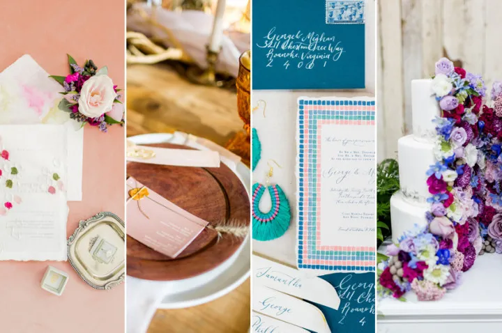
‘Stroke of Midnight’
The ‘Stroke of Midnight’ palette was inspired by the excitement and energy of beginning a new life with your partner. The dramatic purple and fuchsia hues give this palette a modern spin, while the navy blues, grays and shimmering white are timeless and sleek. Because of its old-meets-new vibe, we’re calling ‘Stroke of Midnight’ the must-have palette for couples who are dreaming of a vintage wedding theme. These wedding colors break away from the pale pink, sage green, dusty blue, and black and white palettes you’d normally find at a vintage-inspired wedding, making them an unexpected alternative.
Whether you’re looking for a fresh way to pull off a vintage-inspired wedding or simply want to bring a more refined aesthetic to your big day, ‘Stroke of Midnight’ includes both traditional and glamorous colors. We especially love the blues, grays, and white for wedding attire, while the brighter purple colors are gorgeous for floral arrangements.
See the ‘Stroke of Midnight' color palette »
Now that you’ve seen all of the color palettes...
It’s time to find out which one is right for you. Are you more ‘Love in Bloom’ or ‘Stroke of Midnight’? ‘Golden Hour’ or ‘Paradise Found’? Take our quiz and we’ll reveal your ideal wedding colors!
Photography: Kir2Ben | Venues: Fostr Collaborative and Something Vintage Rentals | Styling: Sincerely Pete Events | Stationery: Alchemy Calligraphy and Design and Calligraphette & Co. | Floral Design: The Rosy Posy | Rentals: Something Vintage Rentals | Wedding Dress: David’s Bridal | Bridesmaid Dresses: David’s Bridal Bridesmaids and Jenny Yoo Collection | Men’s Attire: The Black Tux | Barware: Bed Bath & Beyond | Cakes: Fluffy Thoughts Cakes


