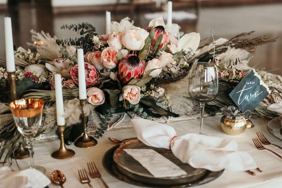
Exactly How to Pick Your Wedding Colors
Creating a beautiful wedding aesthetic requires careful consideration — and a whole lot of planning. The first step is understanding exactly how to pick your wedding colors.
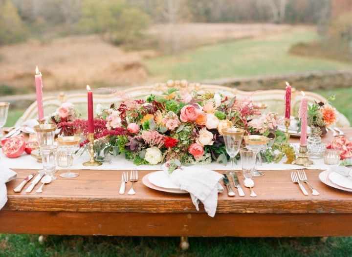
Knowing how to pick your wedding colors is sometimes easier said than done, but it’s an important step in your planning process. In addition to being an extension of your personal styles as a couple, a carefully chosen color palette can make all the difference when creating a cohesive wedding aesthetic. It’s a good idea to start thinking about your wedding color palette shortly after you’ve set a date and chosen a venue, but how should you begin? By considering your basic wedding details, such as season, location, and theme, you can start to narrow down the colors that will play into the look you want. Once you’ve decided on your colors, all of the other decorative details will fall into place, from flowers and stationery, to wedding party attire, table linens, and more.
Here's exactly how to pick your wedding colors step-by-step.
Choose a base color
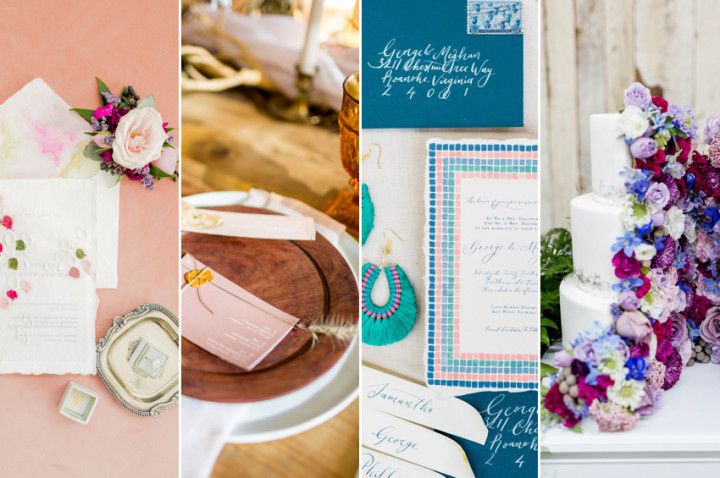
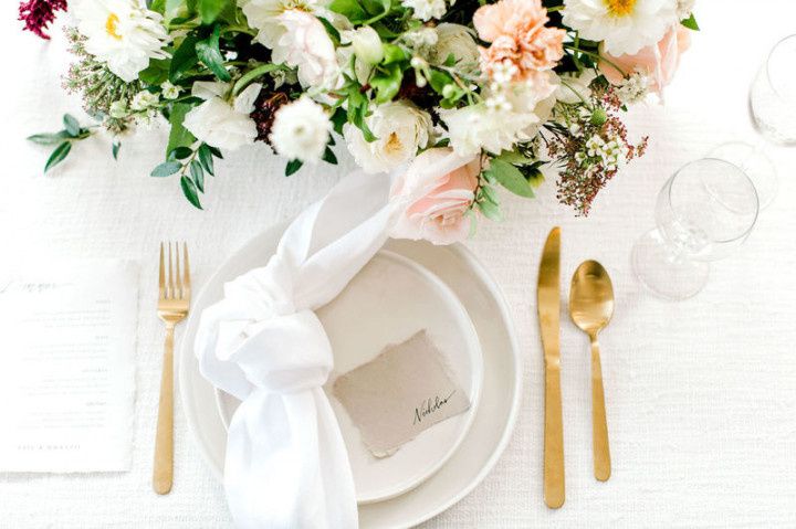
Your base color will be the one that's used most prominently throughout your wedding, and you can't build your full color palette without it. The base color can be anything from soft blush pink or peach to elegant navy blue, punchy yellow, or even dramatic jade green, depending on the overall vibe you want to create. Most importantly, it should be a color you genuinely love! Once you have your base color, the next step is to choose a handful of complementary “accent” colors — generally two or three of them. These accents will round out your wedding palette, adding dimension and variation to prevent the colors from being over-the-top matchy-matchy or kitschy. Your accents can be anything from bold, contrasting hues on the opposite side of the color wheel, to neutral tones like gray, white, black, or beige. No base color yet? Keep reading for more advice on how to pick your wedding colors from scratch.
Think about your wedding season
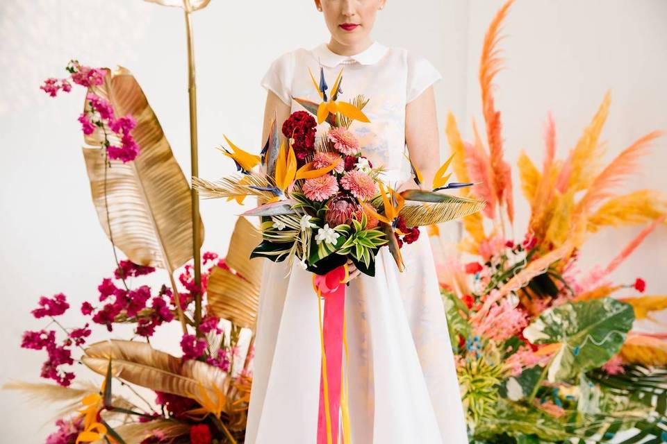
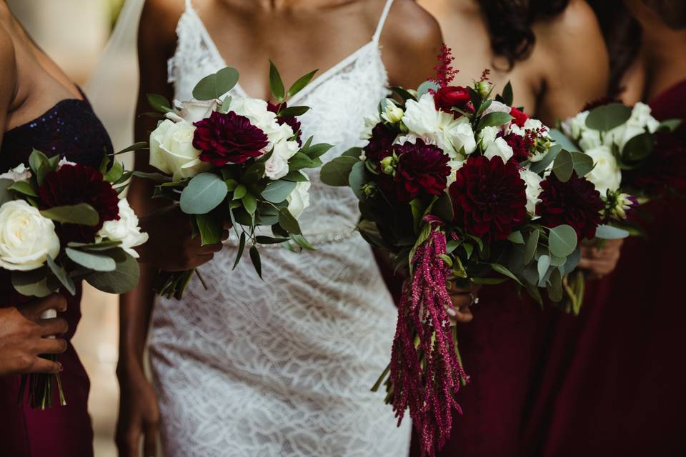
While there’s nothing written in stone that mandates your wedding colors match up with your wedding season, we can’t argue that some colors lend themselves naturally to certain times of the year. If you're feeling stuck when choosing a color palette, look to your wedding season for a bit of inspiration. Dark jewel tones, such as emerald green, plum purple, navy blue, and marsala red, for example, tend fit in better with cold weather surroundings, like changing foliage in the fall or white snow in the winter. Bold and bright colors are generally more appropriate for a summer celebration, while pastel hues are traditionally associated with springtime weddings.
Consider your venue
Next, visualize your venue and its surroundings. Are you getting married in an open-concept warehouse with empty white walls, or an ornate ballroom featuring patterned wallpaper and glamorous gold accents? The existing (or non-existent) details of your venue should influence your color palette. "Blank slate" venues, such as tented receptions, barns, outdoor areas, and other neutral spaces will make it easier to pick your wedding colors from scratch, since you won't have to worry about clashing with existing decor. For other types of venues that are already decorated, such as hotels, country clubs, restaurants, and museums, look at what colors are currently in the space, and use those to determine your palette.
What's your wedding style?
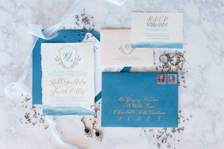
Pinpointing your wedding style or theme is also an essential step when choosing your wedding colors. Just like seasons, some wedding colors are best suited for specific styles — for example, a swanky 1920s, Gatsby-inspired theme wouldn't mesh with bright blue and fuchsia, while metallic gold and purple would look out of place at a nautical soirée. Need some style inspiration? Take a look at these wedding theme ideas. Once you've chosen your wedding style, you can do a process of elimination to help decide which colors will be the best fit.
Pick colors that flatter you
Don't be afraid to be a little selfish when deciding how to pick your wedding colors! Depending on your attire, you may be wearing at least one of your wedding colors on the big day, so it can be helpful to think about the hues that are most flattering for your skin tone. For example, if you're wearing a suit, accessorizing with a tie or pocket square that matches your color palette is tradition. If pale yellow isn't doing you justice, it's totally fine to knock it off the list of potential wedding colors. Even if you're wearing a white dress, you'll want to consider any colorful details of your ensemble, such as your wedding bouquet and accessories. Don't forget about your wedding party members' attire, either! Not only will you be standing next to them in pictures throughout the day, but there's a chance that the people in your wedding party have a variety of skin tones, hair colors, etc. Consider universally-flattering colors — medium and darker shades, such as eggplant, powder blue, navy, and red are some of the best options — and try adding at least one to your palette to keep everyone (including you) looking their best.
Play up your palette with gradients
Can't decide on a collection of colors that look good together? Keep it simple by sticking with one color and opting for an ombré-inspired palette instead. You don't need an assortment of different colors to create a gorgeous palette — for example, a wedding with three or four shades of blue (or whichever color you like best!) can look just as beautiful as one with a rainbow of colors. This option is also excellent for creating a more modern, monochromatic look with your wedding decor.
Use holidays as inspiration
If you’re saying "I do" on or around a holiday, why not incorporate the associated colors into your wedding day aesthetic? Blush and pastels for Easter, green for St. Patrick's day, black and gold for New Year's Eve... the list goes on. The key here is to not take the colors too literally — they should serve as your basic inspiration, not a hard and fast rule. If you opt for a holiday-inspired color palette, avoid using an abundance of themed decor. The colors will be enough!

