
Post content has been hidden

To unblock this content, please click here

Ash 13
Dedicated July 2016

My Rsvp Word and Font opinions please

Ash 13, on March 7, 2015 at 9:31 AM Posted in Do It Yourself 0 20

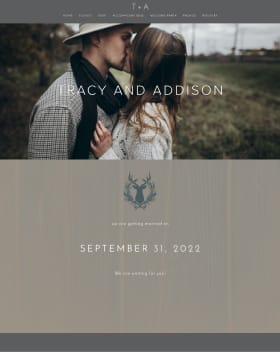
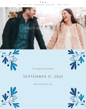
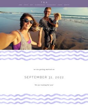
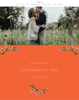
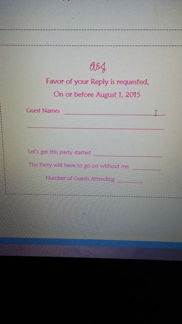
So I have three different font options for our RSVP and INVITATIONS and I need help deciding which one to go with


20 Comments

Latest activity by Charla, on March 9, 2015 at 4:29 PM
  • Ash 13
    Dedicated July 2016
    Ash 13 ·
    • Flag
    • Hide content

    This is the 2nd one


    • Reply
  • Ash 13
    Dedicated July 2016
    Ash 13 ·
    • Flag
    • Hide content

    And this is the 3rd one


    • Reply
  • Nikki
    Master July 2015
    Nikki ·
    • Flag
    • Hide content

    Are your invites going to be more formal? If the invites are pretty formal I like the cursive in the third picture. If not the second one looks good from what I can see its a little hard to tell in your pictures. The wording you are using is fine too IMO its clear and leaves nothing up for question Names and how many attending or if they decline.

    • Reply
  • Ash 13
    Dedicated July 2016
    Ash 13 ·
    • Flag
    • Hide content

    K thank you

    • Reply
  • Crystal L.
    Master August 2015
    Crystal L. ·
    • Flag
    • Hide content

    The second one is my favorite!

    • Reply
  • Ash 13
    Dedicated July 2016
    Ash 13 ·
    • Flag
    • Hide content

    Crystal, i like them all that's why its so hard to decide

    • Reply
  • Allison
    Super October 2015
    Allison ·
    • Flag
    • Hide content

    I like the second one too!

    • Reply
  • Monica SC
    Master October 2015
    Monica SC ·
    • Flag
    • Hide content

    Sorry, I can't really see the pics well enough to make a decision. Love the color though. Smiley smile

    • Reply
  • Diana
    Super August 2015
    Diana ·
    • Flag
    • Hide content

    I'm not sure if it's just the picture quality, but I find the combination of the pink and the fonts a little difficult to read. The font in the first picture is easiest to read.

    • Reply
  • Mrs. Willis
    Dedicated July 2015
    Mrs. Willis ·
    • Flag
    • Hide content

    The first one is easier to read, but I like the second one the best.

    • Reply
  • Victoria
    VIP June 2016
    Victoria ·
    • Flag
    • Hide content

    I think the second one is legible and prettiest. I agree with the pink on a white background though, may be a little hard to read depending on how it prints out. I am also admittedly OCD about wording and formatting so I would say that you should use the wording from the second or change the first one to say "The favor of your reply is requested..." It just sounded odd to me to say "Favor of your reply is requested"

    ETA: If you use RSVP make sure you capitalize all the letters too.

    • Reply
  • Kassie
    VIP September 2015
    Kassie ·
    • Flag
    • Hide content

    I like the 2nd because it matches the top, and it's pretty Smiley smile

    • Reply
  • Katherine
    Super May 2015
    Katherine ·
    • Flag
    • Hide content

    I like the cursive it looks more wedding to me. Instead of saying on or before have you considered saying, "By August 1, 2015" it sounds less wordy than on or before (IMO).

    • Reply
  • Hiatus
    Super December 2014
    Hiatus ·
    • Flag
    • Hide content

    I like the second one :-)

    • Reply
  • Anjum
    Dedicated March 2014
    Anjum ·
    • Flag
    • Hide content

    I think the first was easiest to read, in the pics anyway. I would suggest moving "number of guests attending" to immediately follow the "yes" line.. Since that's the one it corresponds with (not the "we can't make it line").

    • Reply
  • M
    Master July 2015
    m ·
    • Flag
    • Hide content

    Scripts are fine, but choose something that doesn't COME with word, it's getting silly. Everyone can recognize it now!

    www.dafont.com <-- all free.

    • Reply
  • alyshadanielle
    Master April 2015
    alyshadanielle ·
    • Flag
    • Hide content

    I like #1, because it is easiest to read.

    • Reply
  • Ash 13
    Dedicated July 2016
    Ash 13 ·
    • Flag
    • Hide content

    Some of those fonts are from dafont.com I totally love that site! Its really awesome

    • Reply
  • OG FMP
    Master August 2015
    OG FMP ·
    • Flag
    • Hide content

    #3 - Cursive

    • Reply
  • Charla
    Super March 2015
    Charla ·
    • Flag
    • Hide content

    My vote in order.... 2, 1, 3

    • Reply

You voted for . Add a comment 👇

×
WeddingWire celebrates love ...and so does everyone on our site! Explore how we embrace diversity

Groups

WeddingWire article topics