
Post content has been hidden

To unblock this content, please click here

Amber
Super September 2020

Welcome sign - 👍 or 👎

Amber, on November 2, 2019 at 6:24 AM Posted in Do It Yourself 0 8
I'm having someone make me a welcome sign and this is the preview of it. My FH says how the ("A & R") should be capitalized. Looks like she just removed names and date n added our names n date clearly you can tell something was there where she put our names and date.

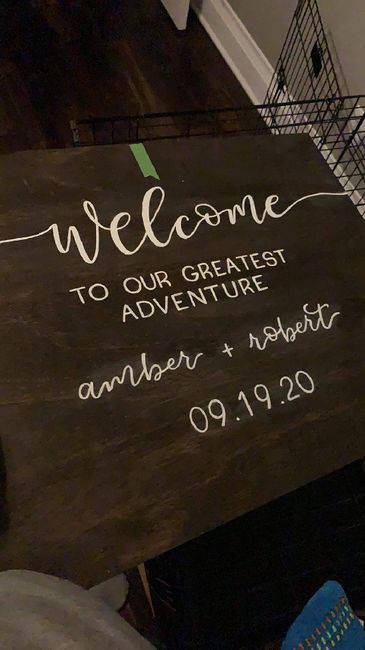
What do I say to her since I'm also purchasing other wedding stuff from her she's doing our names and date on the welcome sign for free.

Welcome sign - 👍 or 👎 1

8 Comments

Latest activity by Amber, on November 5, 2019 at 11:11 AM
  • Caytlyn
    Legend November 2019
    Caytlyn ·
    • Flag
    • Hide content

    She probably didn't capitalize the first letter of your names because lowercase looks better with that font. I also think it's noticeable that there was another name and date there before. I would just ask her about it.

    • Reply
  • Amber
    Super September 2020
    Amber ·
    • Flag
    • Hide content
    View Quoted Comment
    I liked it lowercase but my FH had a problem with it so 🤷...

    I said something to the lady and she replied back

    "Yea, like I said I’m not seeing that now. I think it was probably just from wiping it down, that pot might have been slightly more dry than what was around it!"


    • Reply
  • Megan
    Super October 2020
    Megan ·
    • Flag
    • Hide content
    View Quoted Comment
    Tell your FH that it won’t look as good in upper case and to pick his battles... 😂

    Maybe have her send you another pic with better lighting so you can make sure that smudge isn’t on the sign?
    • Reply
  • Cyndy
    Master May 2019
    Cyndy ·
    • Flag
    • Hide content
    I agree with FH. I would like the names to be capitalized, but the smudge would be a bigger issue to me.
    • Reply
  • Laree's
    Devoted May 2022
    Laree's ·
    • Flag
    • Hide content
    I’ve done vinyl on wood before and after you pull it up it makes marks sometime. The smudges could have been from a stencil she used and not that she wiped away other words. Just throwing that out there, I could be wrong. Also, with some fonts all lowercase looks better, so I’m assuming she made a judgment call. I think the sign looks beautiful and fly out can’t beat free lol
    • Reply
  • Natalie
    Devoted January 2022
    Natalie ·
    • Flag
    • Hide content
    I wouldn’t assume she wiped away someone else’s name/date. Bring yo the smudging concern but definitely don’t go and accuse her of that just yet!

    also I have to agree, the lower case looks better for that style IMO.
    • Reply
  • M
    Legend June 2019
    Melle ·
    • Flag
    • Hide content
    I think it looks nice. Usually the first letter is capitalized but it looks nice not capitalized too
    • Reply
  • Amber
    Super September 2020
    Amber ·
    • Flag
    • Hide content
    I like it but my FH does not.... He said it looks off centered.

    Welcome sign - 👍 or 👎 2
    • Reply

You voted for . Add a comment 👇

×
WeddingWire celebrates love ...and so does everyone on our site! Explore how we embrace diversity

Groups

WeddingWire article topics