
Post content has been hidden

To unblock this content, please click here

S
Just Said Yes July 2021

Invitation design opinion?

Sam, on February 8, 2022 at 5:03 AM Posted in Planning 3 10
Invitation design opinion? 1
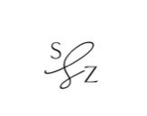
So I wanted our initials at the top of our invitation in the "S&Z" format. I was sent our invite proof by the designers and loved them. This is it, I didn't see a problem with it but my mother made a comment and said she'd never seen an and symbol look like that.
Are other people going to turn their nose up at it too or should I just ask the designer to change it before 8 approve? It looks like they utilized that shape to better fit our initials, I don't know how cohesive "&" would look.

10 Comments

Latest activity by SLY, on February 10, 2022 at 11:38 AM
  • devotedlydavis
    Expert March 2022
    devotedlydavis ·
    • Flag
    • Hide content
    I’ve also never seen an & symbol look like that and honestly wouldn’t have known that’s what it was until you said it. It looks great! But people may not get the meaning of it.
    • Reply
  • A
    Dedicated August 2022
    Ann ·
    • Flag
    • Hide content

    I haven't seen such a design before. But I like it, it's very minimalistic and stylish

    • Reply
  • Jessi
    Super October 2022
    Jessi ·
    • Flag
    • Hide content

    I personally thought it was an L when I saw it and assumed that was going to be the first initial of the last name you guys would share. I still think they could come up with a stylized & that would fit if that's something you want to have them change.

    • Reply
  • Amanda
    Devoted May 2022
    Amanda ·
    • Flag
    • Hide content
    I think it looks like a cursive S. Also the fact that it’s so much larger than the S and Z seems odd.
    • Reply
  • Jmz
    Expert July 2022
    Jmz ·
    • Flag
    • Hide content

    Honestly, I also wouldn't know that it's meant to be something a "&" but I like the idea. I agree with Amanda that what makes it seem even weirder is that it's larger than your actual initials!

    • Reply
  • Grace
    Super February 2022
    Grace ·
    • Flag
    • Hide content
    I would change it to a more traditional ampersand symbol (&Smiley winking. You could also use plus (+) instead.

    Invitation design opinion? 2


    • Reply
  • Samantha
    Expert April 2022
    Samantha ·
    • Flag
    • Hide content
    We have the same initials! 😂 We used a more traditional scripted “&” on our belly band for our invitation suit.
    Invitation design opinion? 3Invitation design opinion? 4


    • Reply
  • Stacey
    Super May 2021
    Stacey ·
    • Flag
    • Hide content

    It looks more like an L than an ampersand to me. I also agree with what someone else said that it's odd that it's larger than your initials.

    • Reply
  • Rosie
    Master February 2022
    Rosie ·
    • Flag
    • Hide content

    I like the way it looks but I agree, it doesn't immediately make me think of an ampersand. I think it's pretty but too abstract to make me think of that.

    • Reply
  • SLY
    Master January 2022
    SLY ·
    • Flag
    • Hide content

    I agree with everyone else, the design itself is minimal which I love, but the symbol doesn't make me think of an ampersand. I thought it was an 'L' for maybe the last name.

    • Reply

You voted for . Add a comment 👇

×
WeddingWire celebrates love ...and so does everyone on our site! Explore how we embrace diversity

Groups

WeddingWire article topics