


Interesting article FH sent to me:
http://www.marketwatch.com/story/this-is-how-much-you-should-spend-on-an-engagement-ring-2016-02-09?dist=afterbell
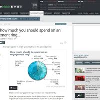
For those that can't access the link from where you're at, here is a picture of the pie chart that was included in the article.
What do you all think - does the distribution seem pretty accurate? I have to say, I was a little surprised that the sub $1,000 ring was the highest percentage on the chart.
