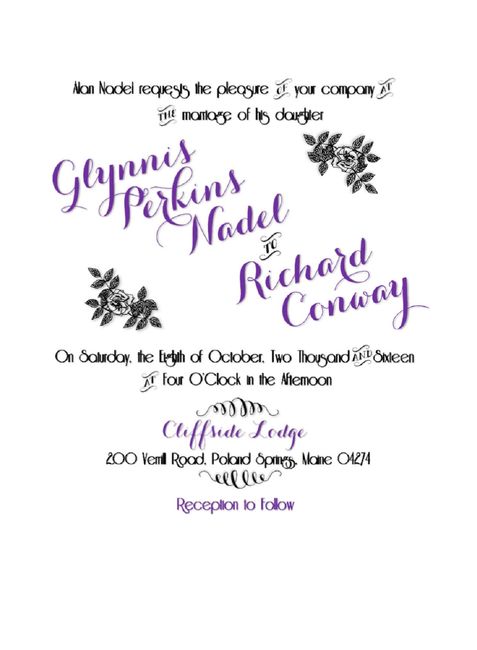








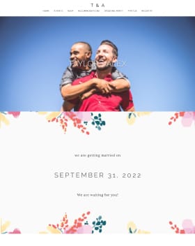



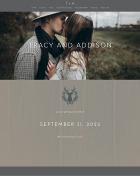

Hello! I was hoping for some feedback on this draft of part of our invitations (still to be done: painted leaves along the bottom and mounted on cardstock). I keep second guessing the fonts and feel like there are spacing issues that I can't seem to fix, but I don't know if they are really issues, or just things I'm imagining as problems from staring at it too long...so some outside input would be appreciated! Thanks muchly!
ETA I had the hardest time getting this image to attach and it's showing up all weird...ugh, I fail at technology, but hopefully it's still readable!